Update : Our submission ‘Fostering Serendipity through Big Linked Data’ has won the Big Data Prize at the Semantic Web Challenge, held during International Semantic Web Conference (ISWC), October 21-25, 2013, in Sydney. The winners are congratulated by Elsevier through dissemination in various online news sources including the Wall Street Journal.
Code : https://github.com/maulikkamdar/tcga-pubmed
Live Demo : http://srvgal78.deri.ie/tcga-pubmed/
Submission : http://challenge.semanticweb.org/2013/submissions/swc2013_submission_17.pdf
A couple of weeks back, some of my DERI colleagues approached me to help them develop an integrated visualization platform over The Cancer Genome Atlas (TCGA) Datasets which they had previously converted to RDF format and linked them to the Life Sciences Linked Open Data (LSLOD) Cloud. Their previous research had won the Linked Data Cup Award at I-Semantics 2013 (Research Paper). They had linked the tumor datasets of TCGA with Publications retrieved from Pubmed which mentioned these tumors (filtered on the basis of a bag-of-words model). Moreover, the individual genes which were found to be methylated in these datasets were co-referenced with the publications which talked about them. The final visualization platform so developed was submitted as a part of the application in the Semantic Web Challenge (Big Data Track) to be held during the International Semantic Web Conference (ISWC) 2013.

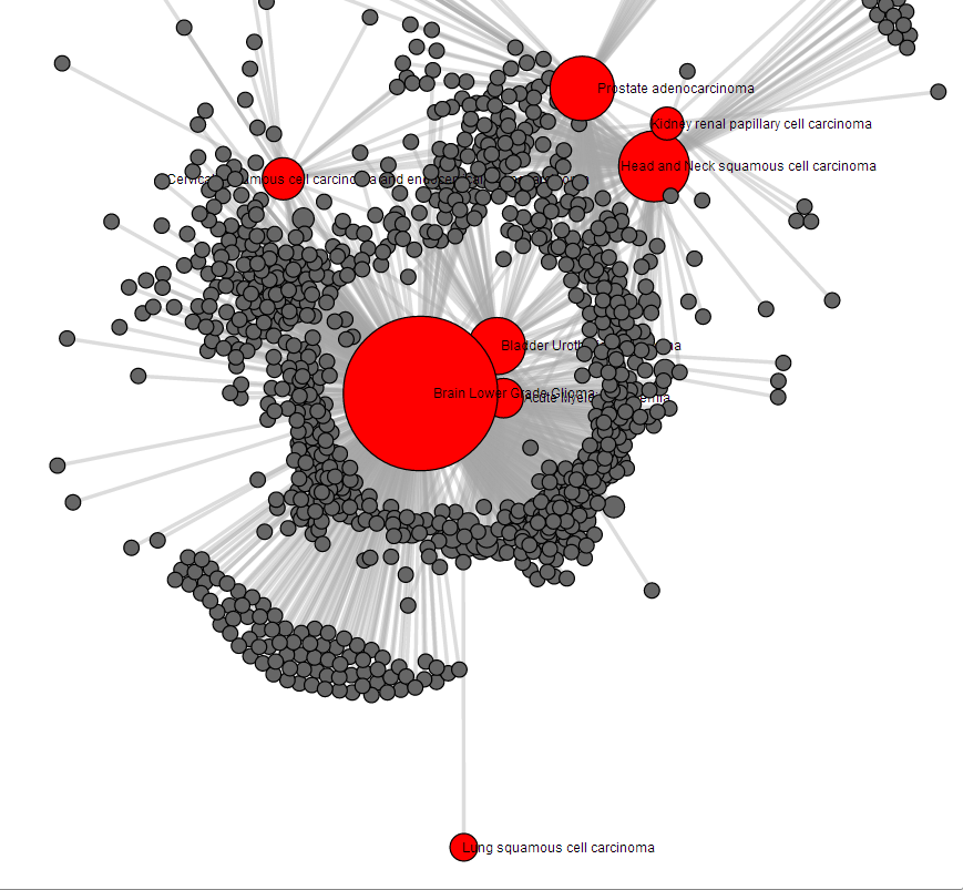
The Integrated Visualization Platform devised to facilitate the intuitive exploration of the Linked Cancer Genome Atlas Datasets, in conjunction with the Pubmed Publications, comprised of three main panels. The interface panels were developed using Twitter Bootstrap and the visualizations were developed using D3 JS and NVD3 JS. The main panel features a highly dense, force-directed network graph linking the different tumor typologies analysed in TCGA to the publication resources where more information about these tumors can be discovered. Two different SPARQL Queries (shown below) are executed simultaneously against a TopFED SPARQL Engine (which federates queries over the Pubmed SPARQL Endpoint) to develop a data structure consisting of nodes (Tumors, Publications, and associated Mesh Terms) and the links (Tumors–> Publications and Publications–> Mesh Terms), which power the underlying visualization.
PREFIX pubmed:<http://bio2rdf.org/pubmed_vocabulary:>
PREFIX purl:<http://purl.org/dc/terms/>
PREFIX xsd: <http://www.w3.org/2001/XMLSchema#>
SELECT DISTINCT ?s ?o ?title WHERE {
       ?s a <http://bio2rdf.org/pubmed_vocabulary:PubMedRecord>;
          pubmed:relatedTo ?o;
          purl:title ?title.
}
PREFIX pubmed:<http://bio2rdf.org/pubmed_vocabulary:>
PREFIX purl:<http://purl.org/dc/terms/>
SELECT DISTINCT ?s ?name WHERE {
       ?s pubmed:mesh_heading ?meshTerm;
          pubmed:relatedTo ?o .
       ?meshTerm pubmed:mesh_descriptor_name ?name
}

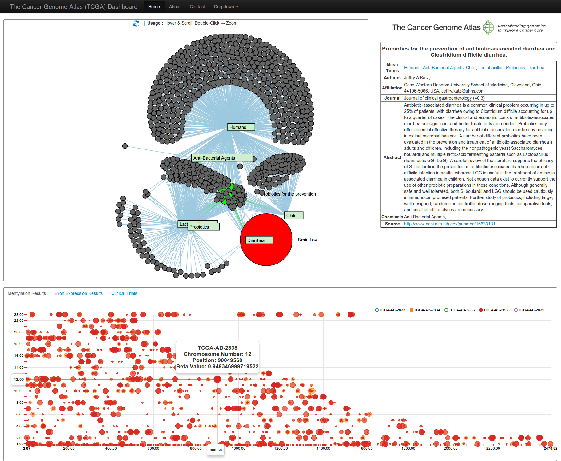
Selecting a publication node presents the metadata of the publication (author, abstract, mesh terms, chemicals cited, etc.) and a link to the original PubMed page, in a tabular format in the side panel. It simultaneously reduces the visualization to its sub-graph, with the selected publication represented as a bright green colored node, with adjacent rectangular nodes representing the Mesh Terms. Publications with common mesh terms are shown as surrounding circular grey nodes. The selection, invokes the execution of a SPARQL Query (Virtuoso has a strange SPARQL String Concatenation format !!), with the Pubmed Publication ID passed as a parameter, and constructs an RDF Graph which is then visualized.
PREFIX pubmed:<http://bio2rdf.org/pubmed_vocabulary:>
PREFIX purl:<http://purl.org/dc/terms/>
PREFIX rdfs:<http://www.w3.org/2000/01/rdf-schema#>
CONSTRUCT {
          <ResourceID> pubmed:Author `bif:concat (?fore, " ", ?last)` ;
                       pubmed:Chemical ?chemicalName; pubmed:Abstract ?abstractText;
                       pubmed:Affiliation ?affiliation;
                       pubmed:Journal `bif:concat (?jtitle, " (", ?jvol, ":", ?jissue, ")")` }
WHERE {
          <ResourceID> pubmed:author ?author .
          ?author pubmed:fore_name ?fore ;
                  pubmed:last_name ?last .
          OPTIONAL {<ResourceID> pubmed:chemical ?chemical.
                    ?chemical rdfs:label ?chemicalName .}
          OPTIONAL {<ResourceID> pubmed:affiliation ?affiliation}
          OPTIONAL {<ResourceID> purl:abstract ?abstract .
                    ?abstract pubmed:abstract_text ?abstractText}
          OPTIONAL {<ResourceID> pubmed:journal ?journal .
                    ?journal pubmed:journal_title ?jtitle;
                             pubmed:journal_volume ?jvol; pubmed:journal_issue ?jissue }
}
On the other hand, selecting a tumor typology node will aggregate the data collected on di fferent cancer patients with that tumor type. Clicking on a tumor node executes the SPARQL Queries shown below in the back-end against the TopFED SPARQL Engine cluster, and retrieves the methylation, exon-expression results, etc. on a patient-per-patient basis. It also reduces the initial visualization to the tumor sub-graph.
SELECT DISTINCT * WHERE {
       GRAPH <TumorID> {
             ?patient <http://tcga.deri.ie/schema/bcr_patient_barcode> ?s
}} LIMIT 5 OFFSET <User-defined Offset>
SELECT DISTINCT * WHERE {
       <PatientID> <http://tcga.deri.ie/schema/result> ?result.
       ?result <http://tcga.deri.ie/schema/chromosome> ?chromosome;
               <http://tcga.deri.ie/schema/position> ?pos;
               <http://tcga.deri.ie/schema/beta_value> ?value
} LIMIT 2000
In addition to the publications data, the methylation (A phenomena known to be highly relevant for cancer progression detection – patterns reflect the silencing or “turning-off ” of cancer protecting genes (i.e. tumour suppressor genes), thus allowing the cancer to progress) results are visualized as scatter plots in a tabbed interface and reflect the amount of methylation in each genomic position, where the chromosomes are indicated against the Y-axis and the specifi c position in the chromosome is on the X-axis. The circles reflect the positions in the genome where methylation was uniquely detected in the cancer cells, and the size of the circles is directly proportional to the amount (beta value) of methylation in that region. The interface allows the simultaneous comparison of these results between different patients and also links the underlying methylated gene to the publication(s) which mentions it. The inspiration for this scatter plot visualization was first derived from the CrossFilter Javascript Library for the exploration of large multivariate datasets in the browsers, but then I came across the NVD3 Example for the same. However, using SVG for representation of cancer datasets (where the number of data points could go to more than 20000 per patient as we are talking about genomic proportions) proved to be troublesome. Somehow I managed to limit my query results to 2000 per patient and show only 5 patients – I intend to migrate entirely from SVG to Canvas later during the development of a full-fledged browser application.
We managed to submit the application to the challenge successfully in time, and while we sit with fingers crossed as the review proceeds (the application has been accepted for the demo at the Conference), I proceed to start my own research on a complete genome browser platform interacting with all these recently exposed datasets, as a lot can be achieved in terms of provision of tools for integrative genomics research.